NOVICHENTO
Logo - Story behind the logo - Branding - Website
Logo

Story behind the logo
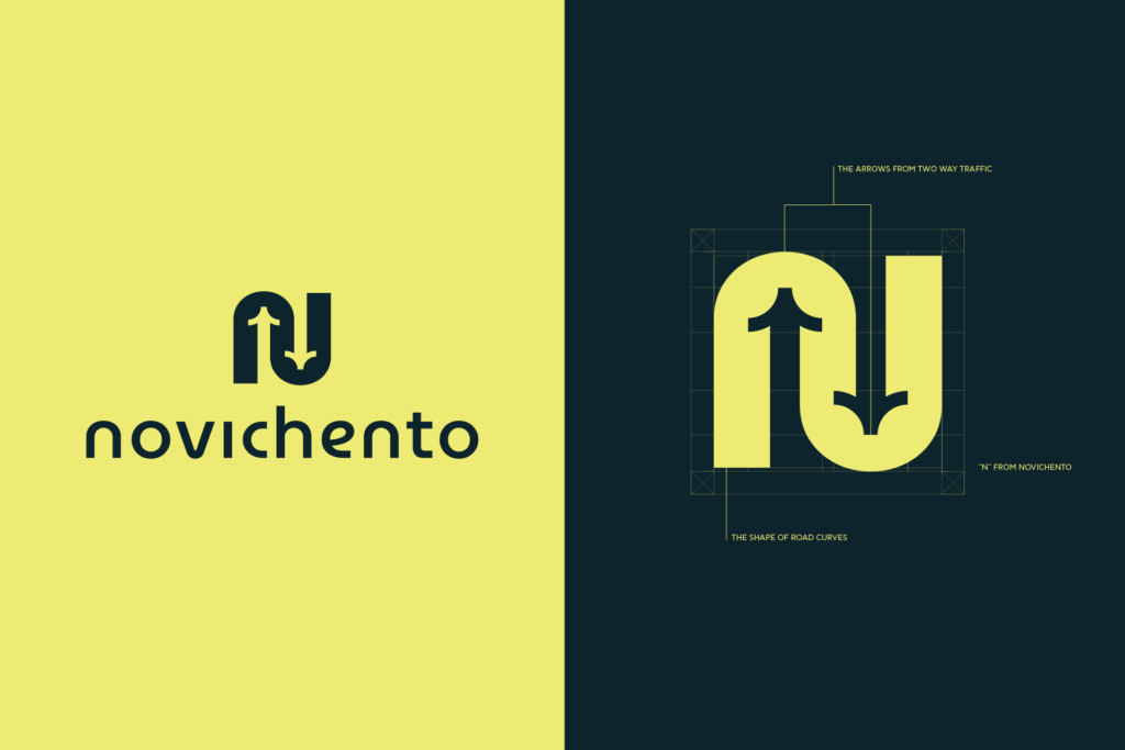
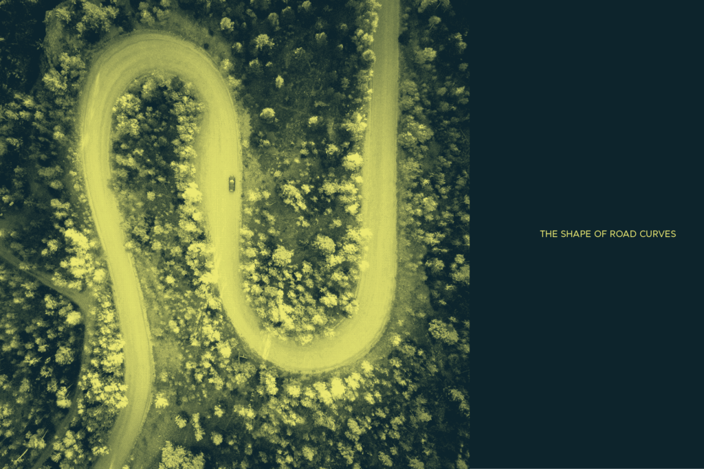

Novichento’s logo takes inspiration from the fluid curves of winding roads, capturing a sense of movement and direction. The design also incorporates elements reminiscent of two-way traffic arrows, symbolizing connection, balance, and dynamic flow. At its core lies the subtle form of the letter “N” from the word Novichento, uniting these concepts into a bold, modern emblem that embodies motion, duality, and identity.
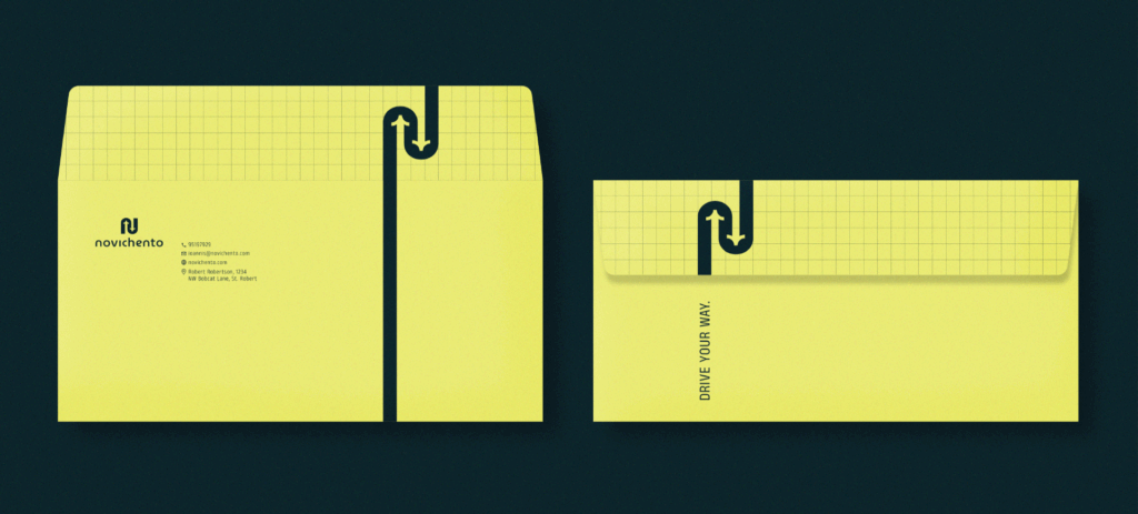
Branding
