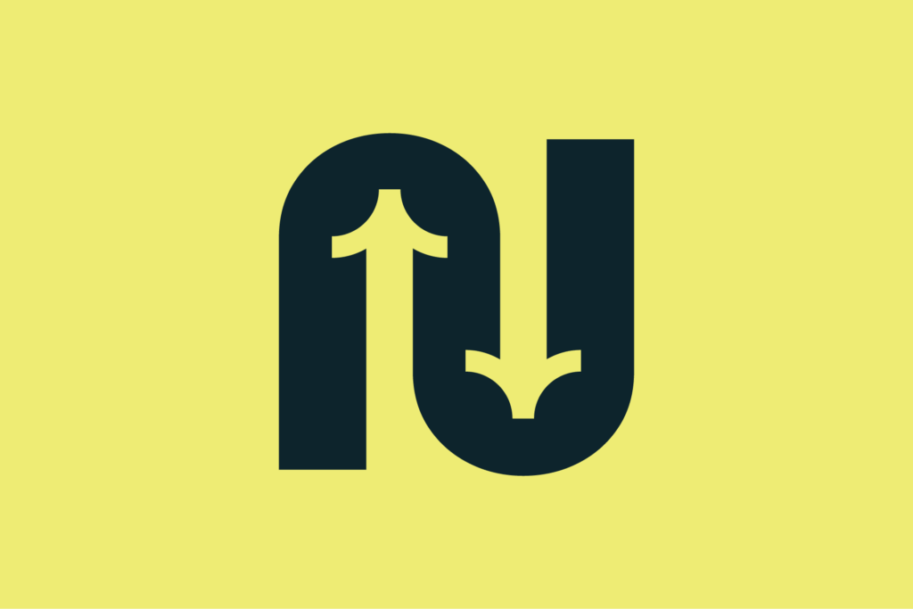
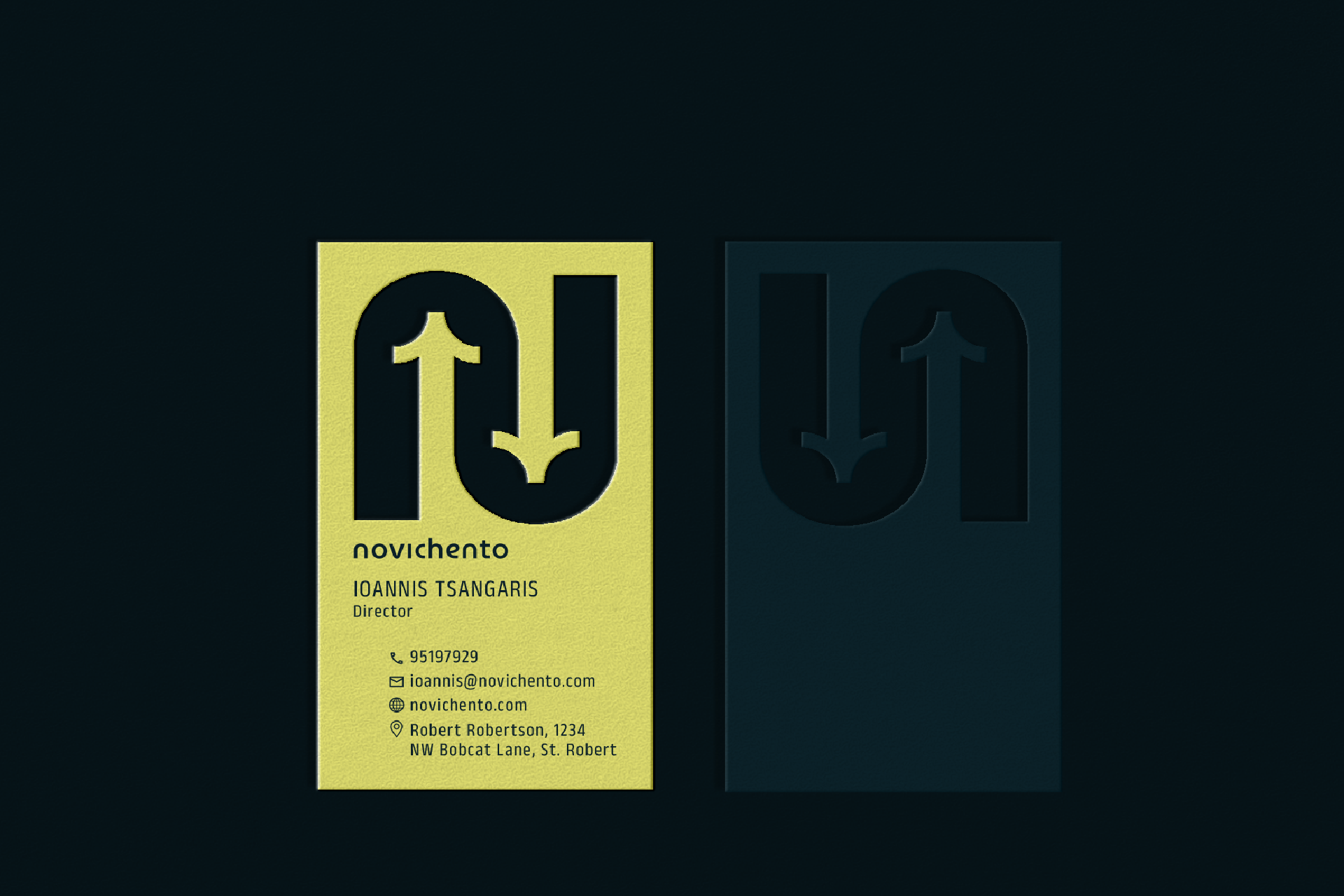
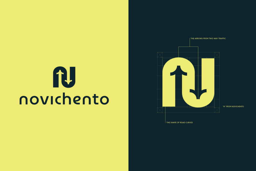
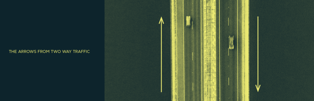
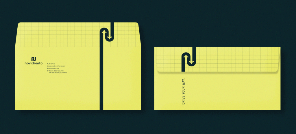
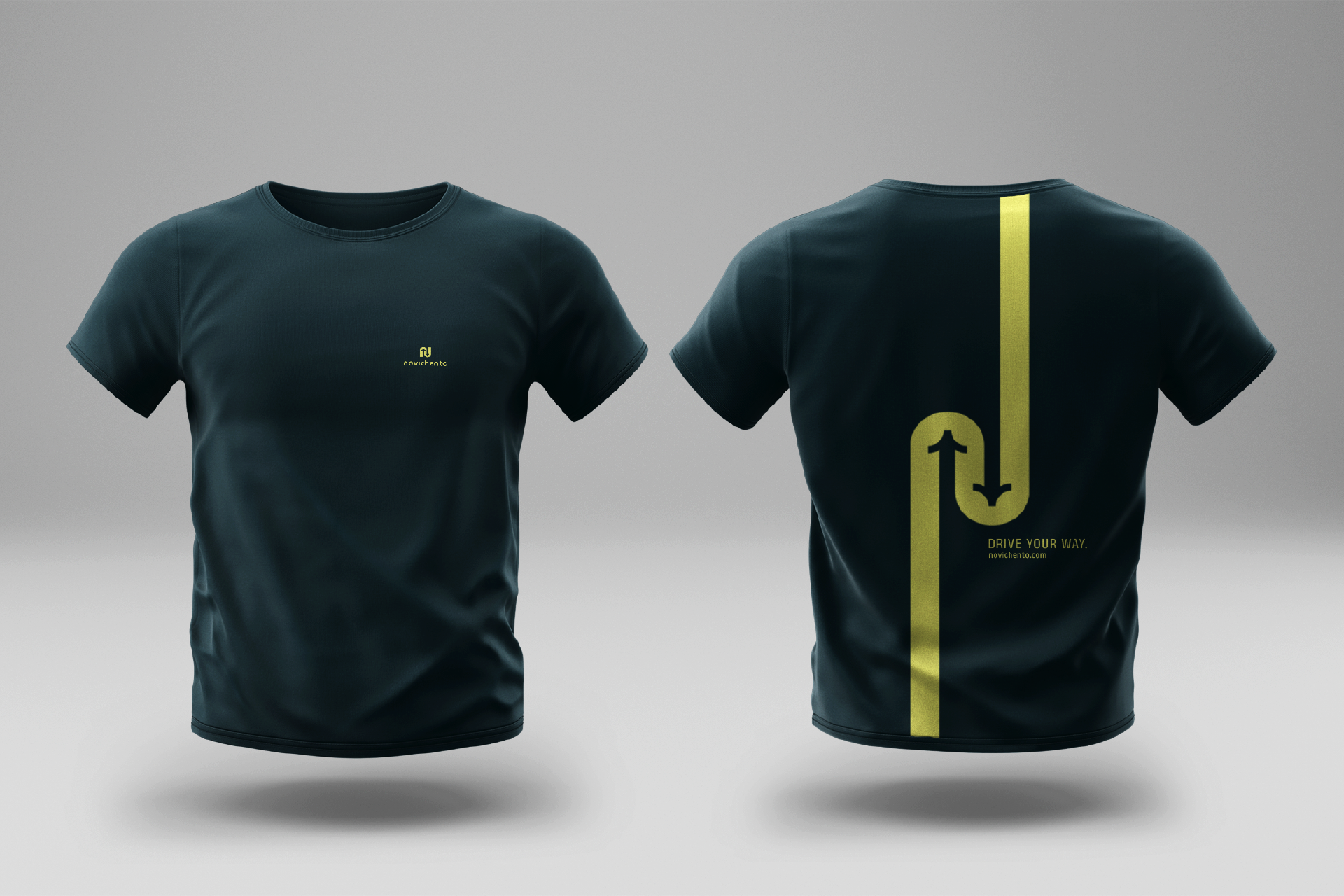
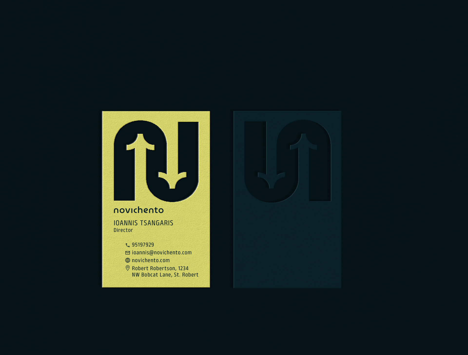
Novichento’s logo takes inspiration from the fluid curves of winding roads, capturing a sense of movement and direction. The design also incorporates elements reminiscent of two-way traffic arrows, symbolizing connection, balance, and dynamic flow. At its core lies the subtle form of the letter “N” from the word Novichento, uniting these concepts into a bold, modern emblem that embodies motion, duality, and identity.
Always open to new adventures, whether you’re a student eager to learn or a company ready to grow. Let’s explore the possibilities together. Don’t let our smile mislead you, we are very serious about our work.